Build Your Own Rich Text Editor
This guide shows you how to create a fast, modular rich text editor using Lexical. It is written clearly and includes a full example, plus we created a custom plugin to show how we can create a new plugin and add it to the lexical editor
Overview — What you will learn
By following this guide you will:
- Create a React project and install Lexical
- Wire up a basic Lexical editor
- Add a simple toolbar (bold, italic, underline)
- Create a custom plugin (Uppercase) — a feature not provided out-of-the-box
- Understand how to extend Lexical with nodes and plugins
What is Lexical and why use it?
Lexical is a modern editor framework (by Meta) that gives you a small core and lets you add features as plugins. It is designed to be:
- Fast
- Modular
- Themeable (you control the CSS)
- Extensible (create your own plugins and nodes)
Think of Lexical as a toolbox: the core gives you the editor surface, and plugins are tools you add when you need extra capabilities.
Step 1 — Create the React project and install Lexical
Open a terminal and run:
npx create-react-app lexical-editor
cd lexical-editor
Then install Lexical packages:
npm install lexical @lexical/react
Step 2 — Create a simple Lexical editor (Editor.js)
This file wires up the editor with a minimal configuration. It shows the basic pieces: the LexicalComposer, a rich text plugin, history, and an on-change plugin.
Editor.js
        import React from "react";
import { LexicalComposer } from "@lexical/react/LexicalComposer";
import { RichTextPlugin } from "@lexical/react/LexicalRichTextPlugin";
import { ContentEditable } from "@lexical/react/LexicalContentEditable";
import { HistoryPlugin } from "@lexical/react/LexicalHistoryPlugin";
import { OnChangePlugin } from "@lexical/react/LexicalOnChangePlugin";

function Editor() {

  const editorConfig = {
    namespace: "MyEditor",
    theme: {},
    onError(error) {
      console.error(error);
    }
  };

  return (
    <LexicalComposer initialConfig={editorConfig}>
      <RichTextPlugin
        contentEditable={<ContentEditable />}
        placeholder={<div>Start typing here...</div>}
      />

      <HistoryPlugin />
      <OnChangePlugin onChange={() => {}} />
    </LexicalComposer>
  );
}

export default Editor;
Save this file as src/Editor.js. This gives you a working but minimal editor — think of it as the blank notebook.
Step 3 — Add a toolbar (Bold, Italic, Underline)
A toolbar is a set of buttons that dispatch commands to the editor. The example below is simple and demonstrates how to call the core formatting command.
ToolbarPlugin.js
import React from "react";
import { FORMAT_TEXT_COMMAND } from "lexical";
import { useLexicalComposerContext } from "@lexical/react/LexicalComposerContext";

export default function ToolbarPlugin() {
  const [editor] = useLexicalComposerContext();

  const format = (type) => {
    editor.dispatchCommand(FORMAT_TEXT_COMMAND, type);
  };

  return (
    <div className="toolbar">
      <button onClick={() => format("bold")}>Bold</button>
      <button onClick={() => format("italic")}>Italic</button>
      <button onClick={() => format("underline")}>Underline</button>
    </div>
  );
}
Import and include this plugin in your Editor.js (place it above the editor area):
import ToolbarPlugin from "./ToolbarPlugin";

...

<ToolbarPlugin />
Now the editor has basic text-formatting controls.
Step 4 — Register nodes and create a theme (optional but common)
When you want support for more content types (tables, code blocks, headings), you register nodes in the editor config. You also define a theme object that maps editor elements to CSS classnames (your stylesheet will define how those classnames look).
Example editor config (registering nodes)
const editorConfig = {
  theme: ExampleTheme,
  onError(error) {
    throw error;
  },
  nodes: [
    HeadingNode,
    ListNode,
    ListItemNode,
    QuoteNode,
    CodeNode,
    CodeHighlightNode,
    TableNode,
    TableCellNode,
    TableRowNode,
    AutoLinkNode,
    LinkNode
  ]
};
Example theme object (map to your CSS)
const exampleTheme = {
  ltr: "ltr",
  rtl: "rtl",
  placeholder: "editor-placeholder",
  paragraph: "editor-paragraph",
  quote: "editor-quote",
  heading: {
    h1: "editor-heading-h1",
    h2: "editor-heading-h2",
    h3: "editor-heading-h3"
  },
  list: {
    nested: {
      listitem: "editor-nested-listitem"
    },
    ol: "editor-list-ol",
    ul: "editor-list-ul",
    listitem: "editor-listitem"
  },
  link: "editor-link",
  text: {
    bold: "editor-text-bold",
    italic: "editor-text-italic",
    underline: "editor-text-underline",
    code: "editor-text-code"
  },
  code: "editor-code",
  codeHighlight: {
    keyword: "editor-tokenAttr",
    string: "editor-tokenSelector",
    number: "editor-tokenProperty",
    comment: "editor-tokenComment",
    function: "editor-tokenFunction"
  }
};

export default exampleTheme;
Add the nodes array and theme reference to the initialConfig you pass to LexicalComposer when you need those features. If you don't register a node, the editor won't know how to render or handle that node type.
Step 5 — Build a custom plugin (Uppercase)
This part shows how to create a small plugin that converts the selected text into uppercase. It's simple but demonstrates three important ideas:
- Read the selection
- Update editor state
- Insert or replace text
We will build a plugin called UppercasePlugin.
UppercasePlugin.js
import React from "react";
import { $getSelection, $isRangeSelection } from "lexical";
import { useLexicalComposerContext } from "@lexical/react/LexicalComposerContext";

export default function UppercasePlugin() {
  const [editor] = useLexicalComposerContext();

  const makeUppercase = () => {
    editor.update(() => {
      const selection = $getSelection();
      if ($isRangeSelection(selection)) {
        // Get the selected text content
        const text = selection.getTextContent();

        // Convert to uppercase
        const upper = text.toUpperCase();

        // Replace the selection with the uppercase text
        selection.insertText(upper);
      }
    });
  };

  return (
    <button onClick={makeUppercase}>
      Uppercase
    </button>
  );
}
How it works (plain language):
- We ask the editor for the current selection.
- If the selection is a normal text range, we read the text.
- We transform the text (to uppercase).
- We insert the new text back into the editor, replacing the old selection.
Add the plugin to your editor just like the toolbar:
import UppercasePlugin from "./UppercasePlugin";

...

<ToolbarPlugin />
<UppercasePlugin />
Now users can select text and click "Uppercase" to transform it. That exact behavior — a new command implemented by you — is a typical custom plugin pattern in Lexical.
Step 6 — Full editor component (example)
Below is one complete example that brings the pieces together. This is an example for src/App.js (you can import the plugin files from ./ToolbarPlugin and ./UppercasePlugin).
App.js
import React from "react";
import Editor from "./Editor";

function App() {
  return (
    <div>
      <h1>My Lexical Editor</h1>
      <Editor />
    </div>
  );
}

export default App;
And the updated Editor.js that uses the toolbar and plugin:
Editor.js (with toolbar + plugin)
import React from "react";
import { LexicalComposer } from "@lexical/react/LexicalComposer";
import { RichTextPlugin } from "@lexical/react/LexicalRichTextPlugin";
import { ContentEditable } from "@lexical/react/LexicalContentEditable";
import { HistoryPlugin } from "@lexical/react/LexicalHistoryPlugin";
import { OnChangePlugin } from "@lexical/react/LexicalOnChangePlugin";

import ToolbarPlugin from "./ToolbarPlugin";
import UppercasePlugin from "./UppercasePlugin";

function Editor() {

  const editorConfig = {
    namespace: "MyEditor",
    theme: {},
    onError(error) {
      console.error(error);
    }
  };

  return (
    <LexicalComposer initialConfig={editorConfig}>
      <div className="editor-shell">

        <ToolbarPlugin />
        <UppercasePlugin />

        <div className="editor-area">
          <RichTextPlugin
            contentEditable={<ContentEditable className="editor-input" />}
            placeholder={<div>Start typing here...</div>}
          />

          <HistoryPlugin />
          <OnChangePlugin onChange={() => { /* handle editor state changes if you need */ }} />
        </div>

      </div>
    </LexicalComposer>
  );
}

export default Editor;
Place ToolbarPlugin.js and UppercasePlugin.js in the same folder (src/), then import them as shown.
Why this approach is useful
Small core, many plugins: ship only what you need — keep the editor fast and small.
Themeable: the editor gives you class names; you write the CSS to match your app.
Extensible: build custom features (like the Uppercase plugin) that suit your product.
Next steps — What to try after this tutorial
- Add a Link plugin (open a small dialog to edit the URL)
- Add an Image upload plugin (upload files and insert image nodes)
- Add Code block highlighting (register a code node and use a syntax highlighter)
- Persist editor content to your backend (save HTML or JSON)
- Write tests for your plugins
Troubleshooting & tips
- If your formatting buttons do nothing: ensure you are using the right command (e.g.,
FORMAT_TEXT_COMMAND) and that the plugin is inside theLexicalComposertree. - If a node doesn't render: check that the node is registered in the
initialConfig.nodesarray. - Use
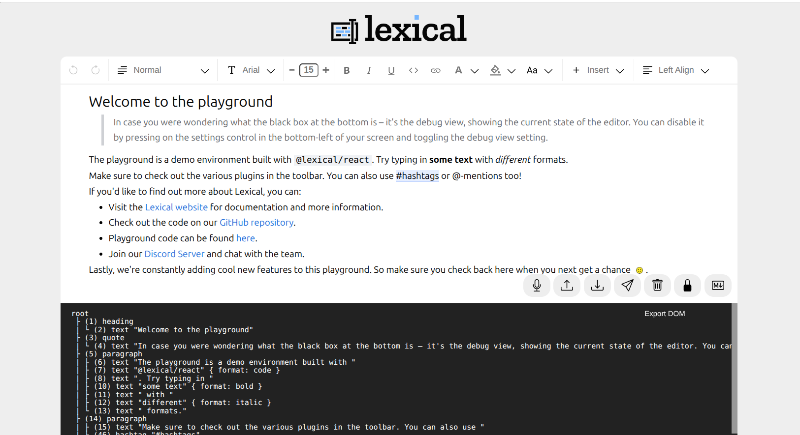
editor.update()for any modifications to the editor state. - For debugging: the community
TreeViewPluginis helpful to see the editor state tree.